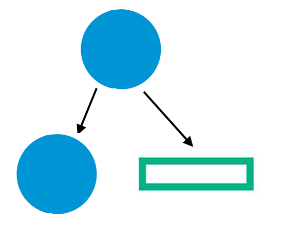
HP splits into a circle and a rectangle? Oh my.
Hewlett-Packard is breaking up. It plans to split into two companies, separating its computer and printer businesses from its faster-growing corporate hardware and services operations.
The computer and printer businesses would be known as “HP Inc.” and the corporate hardware and services businesses as “Hewlett Packard Enterprise.”
Are more-focused companies a good idea? You bet. Each will have more independence and flexibility to prosper in the fast-paced technology world we live in.
Are more-focused brands a good idea? You bet. A focused brand has an opportunity to own an idea in the mind. And also an opportunity to dominate a category and create a visual hammer.
Oddly enough, Hewlett-Packard was once a focused company with two powerful brands. Compaq, the leading personal-computer brand and HP, the leading printer brand.
Then for some reason, the powers-that-be at Hewlett-Packard decided to dump the Compaq brand and sell everything under the HP brand. Not a good idea.
You can’t undo what happened in the past, but you can make changes for the future. So Hewlett-Packard is trying to become more focused by dividing itself in half. But dividing isn’t so easy. It is messy legally, corporately and mentally.
The lawyers can separate the assets, but how to you separate the companies in the mind? One way is with the name, another way is with a visual.
It is a mistake to use the Hewlett-Packard name on both companies. It’s going to cause confusion.
In the past, we have warned companies about the dangers of line extension, putting the company’s brand name on two or more different products. But now companies are doing company extensions, putting the company name on two or more different companies.
Of course, the names look different on paper, HP vs. Hewlett Packard Enterprise. But the more important issue is how people will speak the names.
Hewlett Packard Enterprise. The name is eight syllables long. Nobody is going to use the full name. They are going to call it HP. Which gets them back to the issue of “HP” versus “HP.” This is going to cause endless confusion. Are you talking about the “enterprise company” or the “computer and printer company?”
So what about the visuals? The HP computer and printer business will keep its current logo. And Hewlett Packard Enterprise will get an empty green rectangle as a trademark.
An empty rectangle? Not very exciting. Doesn’t communicate anything. But kind of what you expect from an enterprise consultant, not in a good way.
(H&R Block called. They want their logo back.)
When it comes to trademarks and logotypes, nothing is as dull as a square. Several companies have used the shape with the same boring result.
The Hewlett Packard Enterprises trademark is a long rectangle but still delivers an equally dull impression.
Nationwide Insurance used a square shape for 15 years but recently changed its trademark back to its more-memorable eagle.
Microsoft recently went square.
J.C. Penney’s change to a square was not well received.
The Gap got a lot of negative feedback when it tried to use a blue square behind The Gap name.
People use “shapes” in the vernacular. A “square” is somebody who is “not with it.” On the other hand, the word “circle” is usually used in a positive way.
Neat, organized, buttoned-down people (typically left brainers) often use squares or rectangles for symbols because they reflect their “don’t-rock-the-boat” outlook on life. But if you want to call attention to a symbol, you should avoid dullness at all costs.
The new logo for Hewlett Packard Enterprise is empty and boring. Is the rectangular shape supposed to be a server? If so, it would seems to position them as just another boring computer consulting company.
In terms of the color, they did a good job in choosing something that would distinguish them from the competition. IBM is blue. Ernest & Young is yellow. Accenture is red/orange.
Currently, Hewlett Packard is associated with blue, so the green is a departure from the past. It is difficult to change a position in the mind. The green goes against what you think about HP in the mind.
However, using blue on both logos would have been confusing.
But a “green” color alone isn’t going to solve the marketing problems at Hewlett Packard Enterprise. To differentiate the enterprise company from the computer and printer company would have required a totally new name.
And that would have required a lot of courage on the part of the company’s management.
 ?>
?>