Striking Out Cancer with a Visual Hammer
Every cancer center has a mission, vision and core values. If you looked them all up, they are all pretty similar. It is tough to differentiate your brand.
But the leading cancer center for 10 of the past 13 years according to the U.S. News & World Report’s annual survey, does a few things differently.
1. A focused mission.
Most hospitals try to be the best at everything. This doesn’t usually work. Think like a doctor, be a specialist not a generalist.
The MD Anderson Cancer Center has been focused on cancer for 75 years.
2. A focused message.
When you don’t have a focus, it is hard to develop a powerful slogan. Usually you end up with something generic like “Specializing in You” which Sloan Kettering uses.
The MD Anderson Cancer Center slogan is “Making Cancer History” which it introduced in 1996 and hasn’t changed since.
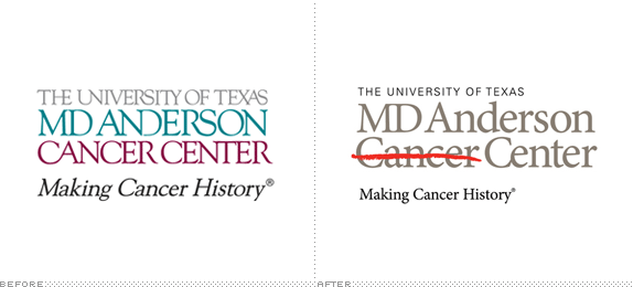
3. A visual hammer.
It is one thing to say your hospital is going to “make cancer history.” It is quite another to visualize it.
What brought this idea to life was the visual. The striking out of cancer with a bright red line.
Initially the line was a just popular video campaign where survivors told their stories and drew a red line through their cancer type to mark their triumph over the disease. After realizing how powerful the red line visual was MD Anderson incorporated it into their logo in 2010.