A milk bottle and a green jacket illustrate the best way to get into a mind.
At the Indianapolis 500 on Memorial Day weekend, one of the most memorable visuals was winner Ryan Hunter-Reay drinking a bottle of milk.
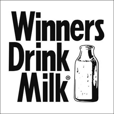
Sponsors Honda and DHL both used milk-drinking visuals in their congratulatory advertisements. Which I’m sure pleased the American Dairy Association of Indiana and its “Winners drink milk” campaign.
It’s ironic that the Indy 500, billed as The Greatest Spectacle in Racing, counts on a bottle of milk to differentiate it from all the other automobile races in the world.
We call the milk bottle a “visual hammer,” one of the most-powerful ways to implant an idea in consumers’ minds.
The green jacket.
In the world of professional golf, there are four major championships: (1) The U.S. Open, (2) The British Open, (3) The PGA Championship and (4) The Masters.
The first three are hosted by major golf organizations, but the Masters is hosted by a private club, the Augusta National Golf Club.
Guess which tournament draws the most attention? The Masters, of course.
There are 38 other golf clubs that host PGA tournaments, but only the one in Augusta, Georgia, is considered a “major.” Why is that?
One reason is the green jacket, the symbol of a Masters Champion.
The tradition of the green jacket dates to 1937. That year, members of the Augusta club wore green jackets during the golf tournament so fans in attendance could easily spot them if they needed to ask questions.
The green jacket is a visual hammer that hammers the idea that the Masters is the most-prestigious golf tournament.
Even an “old” green jack is valuable. Last year, a green jacket that once belonged to Horton Smith, the first Masters champion, was auctioned off for $682,000.
What’s missing in most marketing plans?
Of all professions, marketing is one of the most visually oriented. You might think a typical marketing plan would concern itself mainly primarily with visuals. But it doesn’t.
A typical marketing plan is mostly words. Our marketing meetings are mostly words. Our marketing speeches are mostly words. Our brands are mostly positioned with words.
In the minds of many marketing people, words have a reality that visuals do not. The essence of most marketing programs is to develop a competitive positioning statement for the brand. Then expose that statement, along with a number of alternatives, to a focus group.
The objective is to get the words right. The visuals can come later, courtesy of the advertising agency.
Words are not the same as visuals.
Jonah Lehrer, in his book “Imagine: How Creativity Works,” tells the story of Milton Glaser who was asked to create an ad campaign for the City of New York.
He settled on the words “I love New York” in cursive type against a white background. His design was quickly approved. “Everybody loved it,” Mr. Glaser said.
He had second thoughts, though. And finally conceived the logo that has become one of the most widely imitated works of graphic art. “I (heart) NY.”

“I love New York” and “I (heart) NY” communicate exactly the same thing, but the visual says it emotionally which makes all the difference.
A visual activates the right side of your brain (the emotional side) while a verbal activates the left side of your brain (the logical side.) A visual and a verbal may mean the same thing, but they don’t have the same effect on the consumer.
A trademark is not a visual hammer.
Most trademarks are designed for only two functions: (1) To be visually attractive, and (2) To identify the brand.
A white apple with a bite taken out of it tells the consumer the product was made by Apple, Inc. That’s all.
A circle with the letters “HP” tells the consumer the product was made by Hewlett-Packard. That’s all.
A visual hammer on the other hand, says something significant about the brand.
• The “polo player” says Ralph Lauren is an upscale brand.
• The “mountains” say Evian water comes from the French Alps.
• The “contour bottle” says Coca-Cola is the original, the authentic cola.
• The “lime” says Corona is the authentic Mexican beer.
• The “stagecoach” says Wells Fargo has been a financially-stable bank for an awfully long time.
• The “Clydesdales” say Budweiser is the King of Beers, reinforcing its leadership position.
Five times in the past 15 years, including 2014, a Budweiser commercial
featuring Clydesdales has won the USA Today Ad Meter award. An indication of the visual power of this device.
Unfortunately the rest of the year, the brand runs such innocuous concepts like “Grab some Buds” for Budweiser and “Here we go” for Bud Light.
Why don’t more brands use visual hammers?
They can’t. Unless a brand has a narrow focus, it’s impossible to develop a visual hammer that communicates anything specific.
What visual hammer would work for Sony, a brand that encompasses everything from digital cameras to video-game players to television sets to personal computers?
What visual hammer would work for Chevrolet, a brand that encompasses everything from cheap cars to expensive cars to SUVs to sports cars to trucks?
Before Marlboro cigarettes were launched in 1953, there were five strong cigarette brands on the market: Lucky Strike, Camel, Winston, Chesterfield and Philip Morris. These five brands appealed to both men and women. (In those days, almost every cigarette ad included both a man and a woman.)
That made sense in the market where 50 percent of adult men smoked, but only 20 percent of adult women. “We’ve got the men,” went the thinking, “so let’s go after the women.”
But it didn’t make sense in the mind. To get into a mind, you need a narrow approach. So Marlboro targeted men only, one of the first cigarette brands to do so. That was its narrow focus. And the cowboy was chosen to symbolize a “masculine” cigarette.
How successful was Marlboro? It’s the world’s largest-selling cigarette brand, outselling the No.2 brand (Winston) by 130 percent.
Take another look at your own marketing plan. Is there a milk bottle in your plan? A green jacket? A cowboy?
Why not? The best way into a human mind is with a visual hammer.